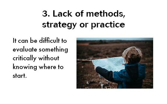
Images can add to a presentation by helping to explain a point or making it more memorable. They also make your presentation more attractive and interesting to look at. However, at times images can detract from a presentation due to things like poor placement or poor image quality.
There are a large number of resources available online that give information on what makes a good PowerPoint slide and how to best present images, but here are three quick and easy tips to make the most of the images that you decide to use.
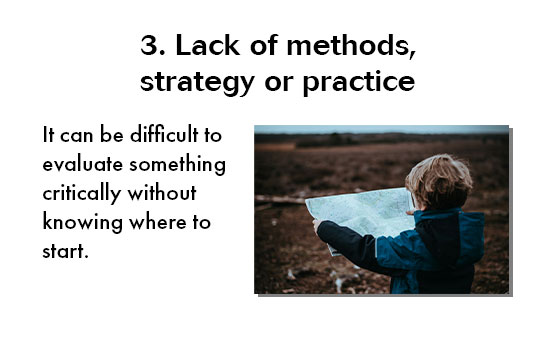
1. Consider putting images in frames
Putting a line and/or shadow frame around your image can help it stand out more.
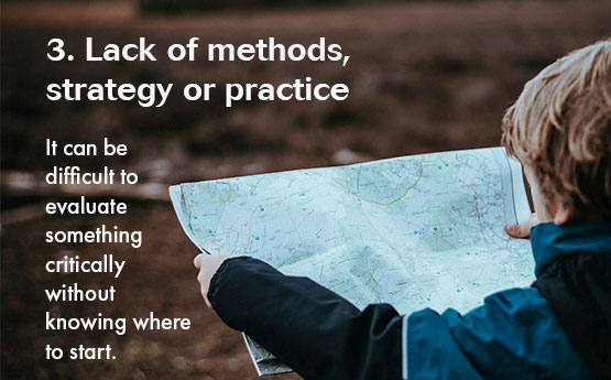
2. Consider using the image as a background
This can make your slides look more attractive and professional. It may also be useful if the image is representing the point on the slide in a more abstract way. However, you have to be careful to make sure the text is still readable. One option to help you make the text stand out is to add a transparent rectangle in-between the background image and the text. You can alter how transparent the rectangle is to make the text stand out more from the background.
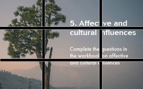
3. Align the image to draw attention
Photographers often frame their images by splitting them into thirds and situating the main object in the picture along one of the vertical or horizontal lines. You can do the same for slides. The points where the lines cross gain most attention.
Slide design is subjective, but I think these tips can help you use images in a better way. Try them out on your next presentation and see how it changes.